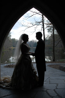
I've been a long-time hobbyist user of Photoshop and related software, starting with (if I remember correctly) Photoshop 4.0 for Mac back in the mid 1990s. It's a fun program to just play around with (at least, it is if you're a geek like me) as the sheer range of functionality in the program makes it possible to create some truly remarkable (and/or hideous) results without hardly knowing what you're doing. (True experts can do even better, of course, but I make no claim to that level of skill!) Just to give you an idea of the things it can do, in the past I've used Photoshop to:
- preview what my parents' house would look like if repainted in a different color
- create matching sepia-toned pictures of all the dogs my parents have owned in the last 40 years
- insert Mr. T into a group photo (long story...)
- mock up a china cabinet design based on images found online that were almost right but not quite
- remove extraneous tourists from the background of a picture of us in Las Vegas
- and so forth. It's a very cool program!

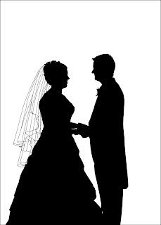
I'm especially proud of how Heather's veil turned out in the final image:

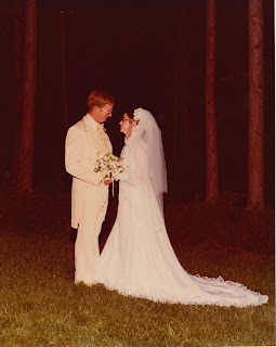
This spring, a copy of Heather's parents' wedding picture found its way into our scanner, so we decided to give it the same treatment as a gift for them. This picture was the reverse of ours, having light figures on a dark background instead of the other way around:

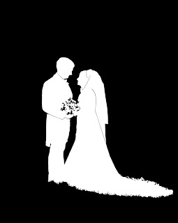
so I decided to stay with this style, and go for white silhouettes on black for a bit of a different look. It wasn't possible in this case to go for the same sort of effect with the veil (as I couldn't clearly define where the back of Cathy's head ended and where the veil began) but I knew I had to add some sort of detailing to keep the silhouette from becoming too shapeless. After some experimentation (and some excellent insights from Heather) we determined that less is more in this image, so I ended up only adding a few key outlines to the final result:

I find it interesting that the flowers and the edges of Cathy's train on the grass look so complicated, yet were really easy to create (a few quick Photoshop filters and bam!), while the parts that gave me the most challenge (the choice of which lines to include, editing eyeglasses out of the silhouette, etc.) look so simple in the final result. I wonder if most art is that way?
No comments:
Post a Comment